Horse sounds


Recordings of horses in a paddock eating an apple and sniffing/snorting.
While trying to show the spirit of the horse I've been caught up in the visual image of the horse. When really a horse makes noise, feels hot and warm, smells and excites our senses in so many more ways than just the way we see them.
So I went out to record some noises to just take away that image and see if there is still the same effect.. If anything I think there is a stronger effect hearing the noises than seeing images of drawings.. The drawings make you think of what you see, a prancing pony. But the noises make you think up your own images from your own knowledge of the horse that's triggered by those sounds. Even if you have no memories of ever having been around horses, the noises alone could create a totally unique image to you according to what you associate with those sounds. Which I think is stronger than our visual sense we rely too much on.

This is why I've decided I want to break away from just producing graphite sketches on paper as I don't think I'm going to capture the essence or spirit of the horse alone on paper. So change of plan to my only draw in sketchbooks idea! But I think when I'm finished a mixture of different works in different mediums will be more visually exciting and if I experiment far and wide I'll have a much better chance at achieving my brief. Because at the moment I'm not really sure what I'm trying to show, I mean I know I want to show the spirit of the horse but right now I'm not fully sure on what I even think that is.

3D scupltures & Mark Wallinger

Made using twigs, leaves, wire etc.. I wanted to try making a more physical representation of the horse and 3D seemed like a good direction for that.


This is the 'horse' that started me working in 3D, I was up late and wanted to try something completely different to drawing and painting. It looks more like a deer/muntjac/bunny.


I've also started looking at Mark Wallinger and his public horse art. This year he made a life size statue of a shocking white horse, unmounted and untacked. I don't think it's a very true representation of the spirit of the horse as the horse is very obviously human domesticated in its appearance with its short well kept mane and similar tail and solid all over muscle and good weight without a grass belly.

Something I found really interesting to read was part of this article I found by The Independent;
"In any equestrian statue, the horse exists to exalt or to set off the man who is its mount. We are also being persuaded that something of the power and the musculature of the horse itself seeps into the very veins of the man, apportioning him some of its animal strength and vigour.
Wallinger's horse feels both related and unrelated to all these equestrian manifestations in a number of interesting ways. It is unmounted for a start, and it is nothing but horse without tackle, wholly unencumbered. It is not there to be seen in relation to the one who subjugates it or shows himself off at its expense. It does not exist to point a tale, martial or monarchical. Being quite shockingly white – especially when the sun blazes out – it puts us in mind of England's bevy of white horses out in the landscape, those strange apparitions in white silhouette that exist on our chalky, gently rising hillsides as we shift towards the West, and whose symbolic importance we often find ourselves musing upon as we rush by them in train or car."

Source: Link to source

This works well with my belief of how man is commonly known for representing the horse throughout history in art. The piece of his I'm really interested in is his plan to create a bigger than life size massive white standing horse. Again he plans to make this horse unmounted, but unlike his work this year he wants the horse to wear a black head collar.

I think this shows the oppression and control man has over the animal. It is a sculpture that will show the control man has over the animal, the ownership. His public art will be a massive showing of just how well man controls its animals. Because us humans do suppress our animals by domesticating them. We put all these man made contraptions on them and it takes away at the part of the horse that makes it a horse. The natural spirit of the horse is contaminated by our control.

A4 watercolour paper ink experimentation

 Here I experimented with watercolour over inks and didn't like the outcome at all. I think the colour looks unnecessary and the black clashes horribly with the light airy colours and makes the drawing look heavy.


I don’t think the colour adds much to the drawings and I had a problem trying to properly clean out the ink pen so there are drawings that are quite murky and dirty. I kept to a safe colour combination of red, orange and yellow being the main colour I did the base sketch with. I think that may have been where the drawings looked wrong, I laid down a base sketch which if it had been ink would have been the complete drawing, and then went over the lines with the two other colours making certain areas and lines bolder and more dominant. I don’t think my drawings need this and the colour doesn't look like it means anything with my drawings as it doesn’t fill in the horse. So I will continue using inks but will most likely leave the colour for now till my understanding of colour is better and I have a well-developed idea of why I want to use the colour and reason to.


My favourite drawings are my more spontaneous works where I haven’t used a source picture. Even though some of the positions look unperfected and impossible I think these drawings feel looser and freer without a loss of flow where I have to look up at my source image and be careful in trying to duplicate it. The source-less images have more emotion in them and I tend to leave more of the horse incomplete and to the imagination which works better than drawing the full form. When I copy the whole form down the drawings often look heavy, where as if I leave legs, backs and tails as squiggles and have floating shoes and knees the drawing feels lighter and airier and I think work better.


A3 ink drawings

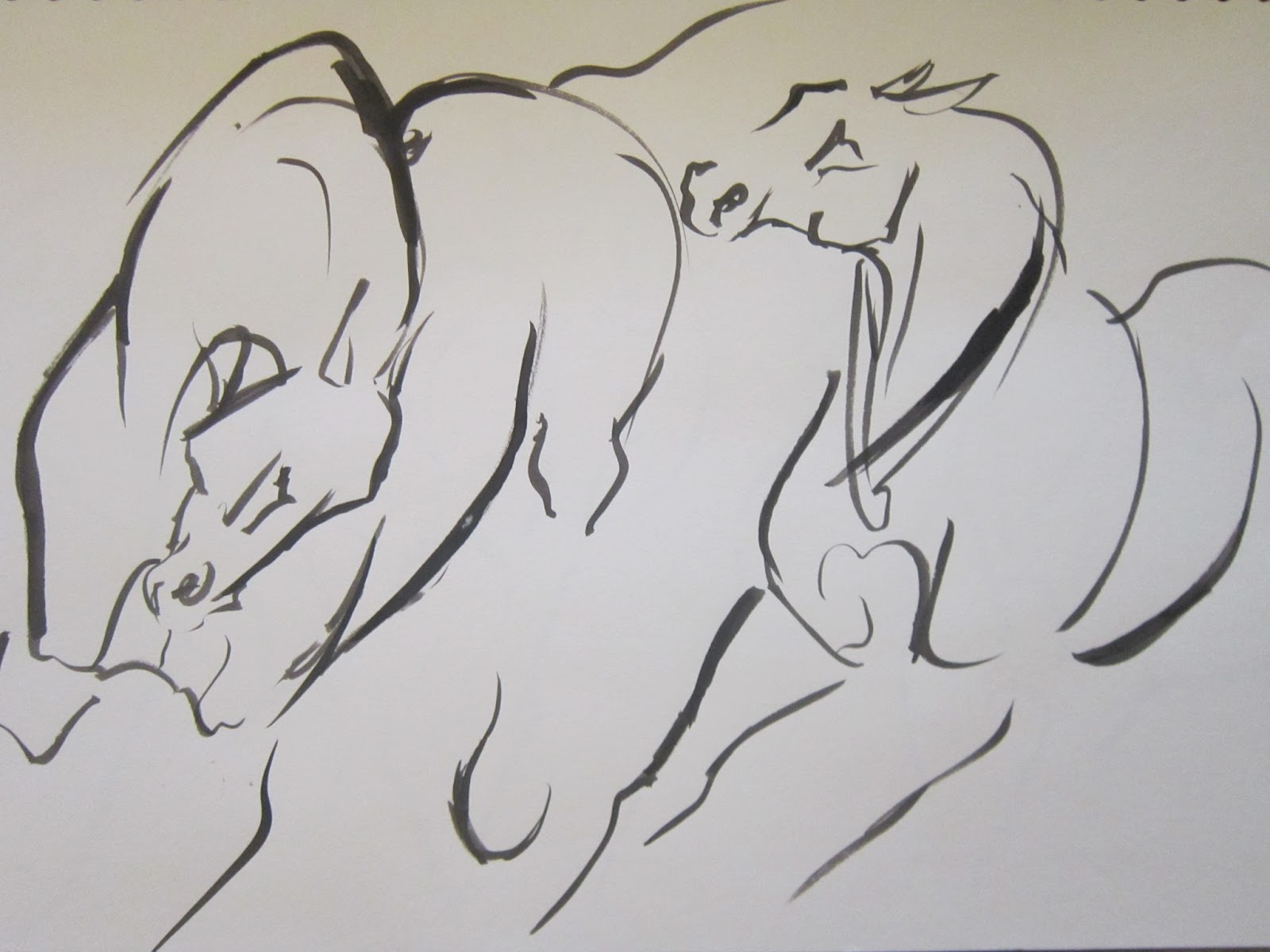
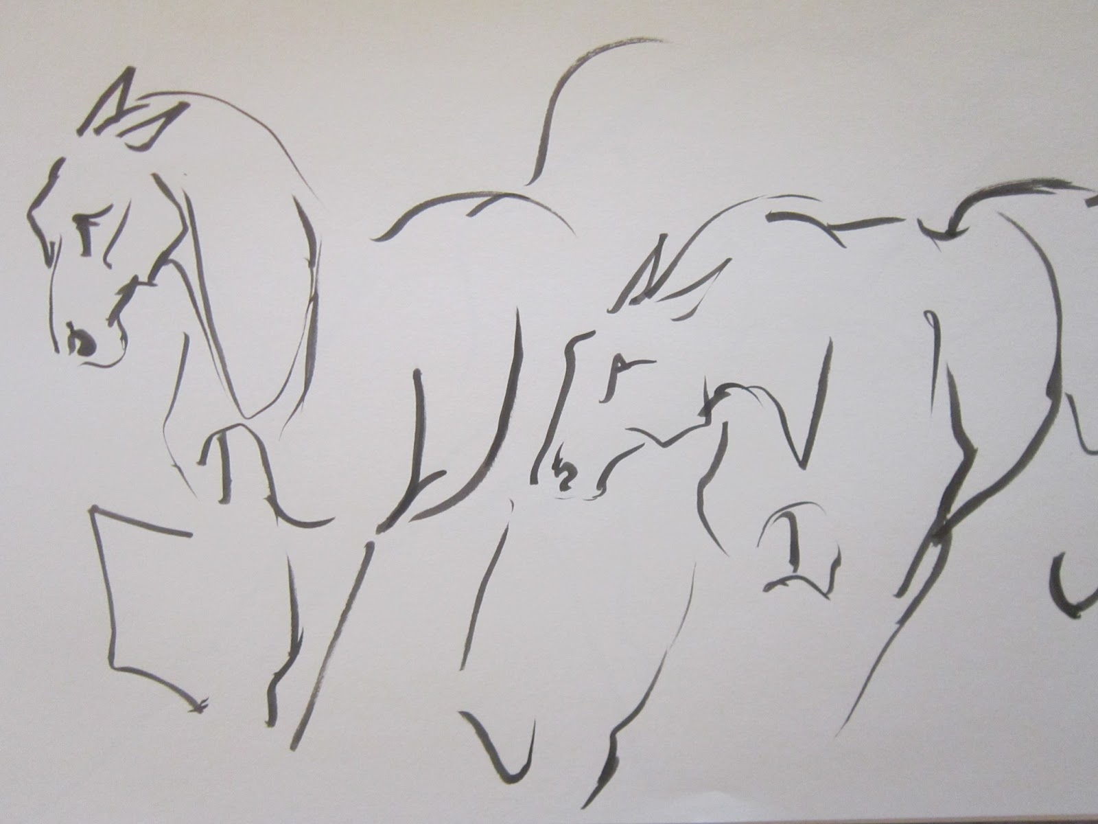
I have been experimenting with multiple horses in a larger A3 sketchbook in inks. I want to try and capture some interaction and natural harmony between the horses and the ink works well to blend the horses together with finer lines while bringing a main focus with the thicker lines to the important muscles of the horses that help define and show motion. 


This is one of my heavier drawings that haven’t worked so well where I’ve made mistakes and the extra lines have made the legs look too thick.


I think this drawing has worked particularly well in ink where the tails and legs tangle together then flow out and disappear.


Ink experimentation

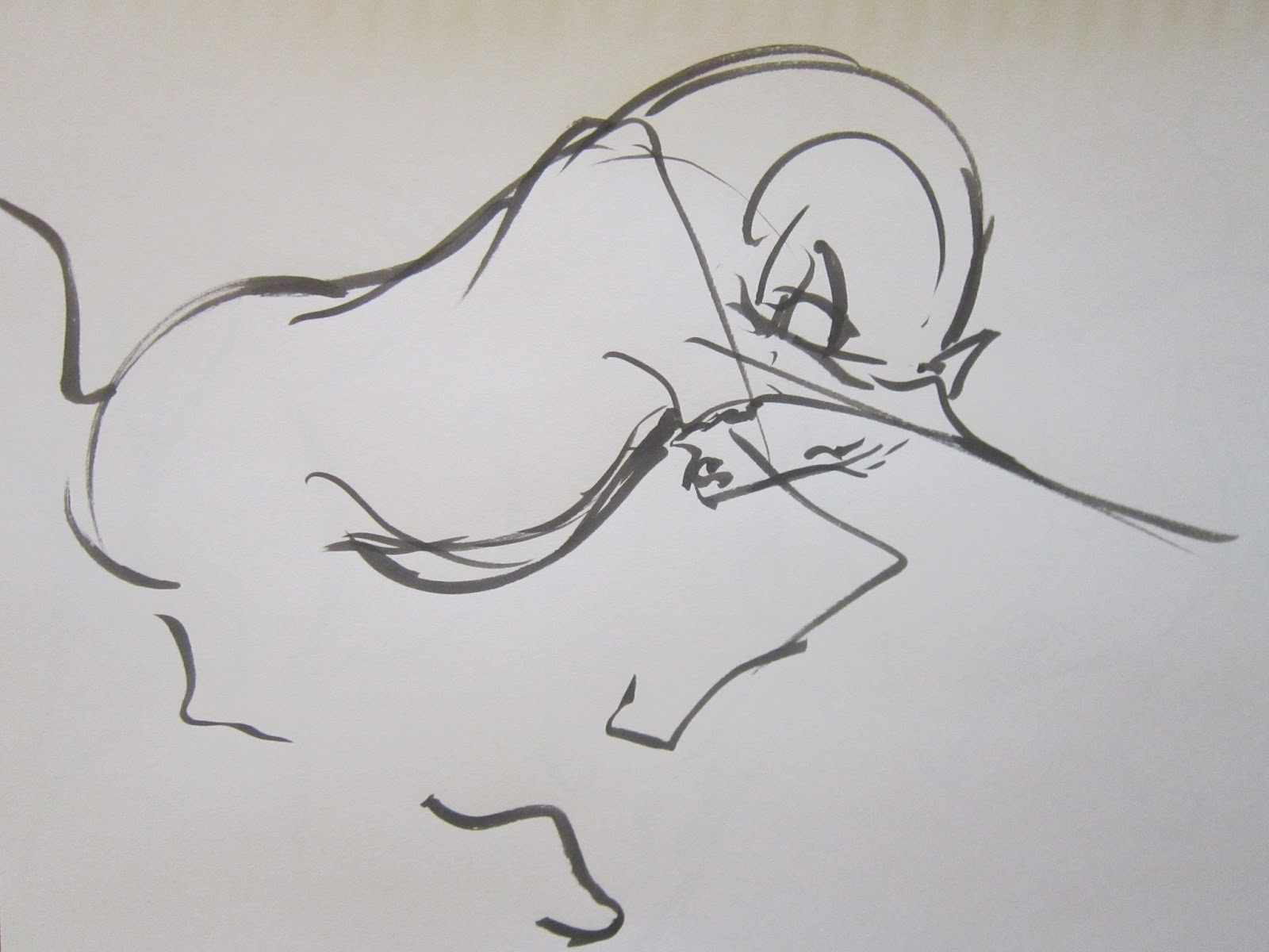
I’ve enjoyed using ink so far and have had the most success working on watercolour paper leaving out parts of the horse. I think the drawings that have worked best are the looser ones with less of the horses form showing and with legs disappearing off the edge of the page. The drawings that haven’t work so well are the ones that have a consistent thickness of ink throughout the drawing where I’ve applied the same pressure to the paper. The drawings work better with thicker and thinner lines as they help ease the lines of the form out and making the ink look gentler and less bulky. I think the ink brings a little extra to my drawings and it improves some of my looser drawings making them bolder and more striking at a glance. 


I have ideas of where I want to take these ink drawings, I've been thinking of doing a body of work that is entirely drawings and sketchbook work. I'll see how the experimentations go within the drawings.

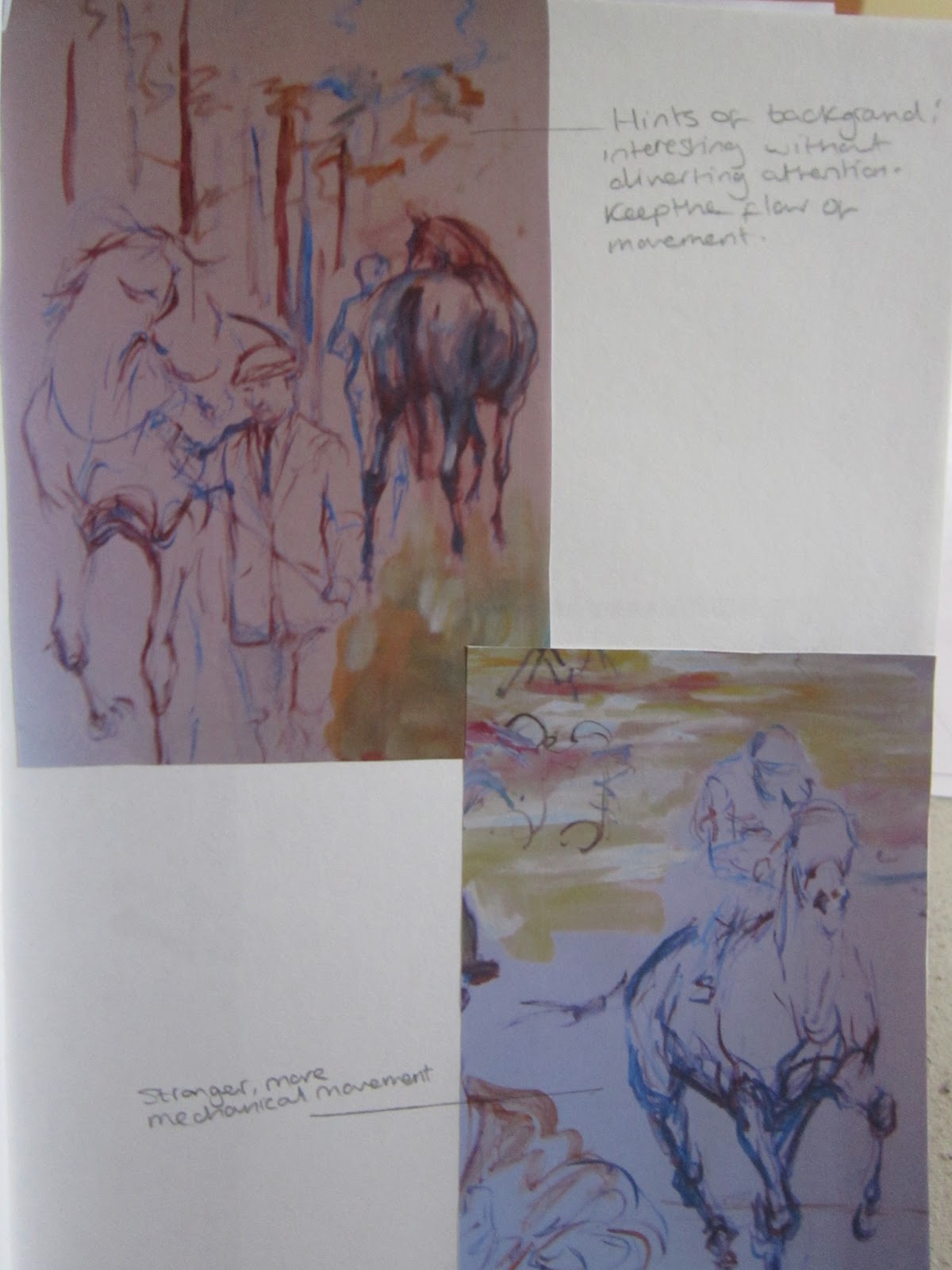
Jacquie Jones

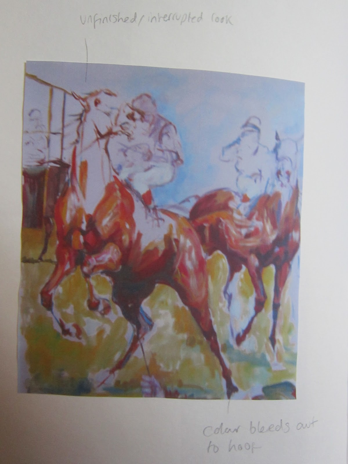
These are photos I took at the museum of Jacquie Jones's work in the cafe with notes and some of my own sketches.