A4 watercolour paper ink experimentation

 Here I experimented with watercolour over inks and didn't like the outcome at all. I think the colour looks unnecessary and the black clashes horribly with the light airy colours and makes the drawing look heavy.


I don’t think the colour adds much to the drawings and I had a problem trying to properly clean out the ink pen so there are drawings that are quite murky and dirty. I kept to a safe colour combination of red, orange and yellow being the main colour I did the base sketch with. I think that may have been where the drawings looked wrong, I laid down a base sketch which if it had been ink would have been the complete drawing, and then went over the lines with the two other colours making certain areas and lines bolder and more dominant. I don’t think my drawings need this and the colour doesn't look like it means anything with my drawings as it doesn’t fill in the horse. So I will continue using inks but will most likely leave the colour for now till my understanding of colour is better and I have a well-developed idea of why I want to use the colour and reason to.


My favourite drawings are my more spontaneous works where I haven’t used a source picture. Even though some of the positions look unperfected and impossible I think these drawings feel looser and freer without a loss of flow where I have to look up at my source image and be careful in trying to duplicate it. The source-less images have more emotion in them and I tend to leave more of the horse incomplete and to the imagination which works better than drawing the full form. When I copy the whole form down the drawings often look heavy, where as if I leave legs, backs and tails as squiggles and have floating shoes and knees the drawing feels lighter and airier and I think work better.


A3 ink drawings

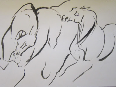
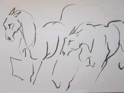
I have been experimenting with multiple horses in a larger A3 sketchbook in inks. I want to try and capture some interaction and natural harmony between the horses and the ink works well to blend the horses together with finer lines while bringing a main focus with the thicker lines to the important muscles of the horses that help define and show motion. 


This is one of my heavier drawings that haven’t worked so well where I’ve made mistakes and the extra lines have made the legs look too thick.


I think this drawing has worked particularly well in ink where the tails and legs tangle together then flow out and disappear.


Ink experimentation

I’ve enjoyed using ink so far and have had the most success working on watercolour paper leaving out parts of the horse. I think the drawings that have worked best are the looser ones with less of the horses form showing and with legs disappearing off the edge of the page. The drawings that haven’t work so well are the ones that have a consistent thickness of ink throughout the drawing where I’ve applied the same pressure to the paper. The drawings work better with thicker and thinner lines as they help ease the lines of the form out and making the ink look gentler and less bulky. I think the ink brings a little extra to my drawings and it improves some of my looser drawings making them bolder and more striking at a glance. 


I have ideas of where I want to take these ink drawings, I've been thinking of doing a body of work that is entirely drawings and sketchbook work. I'll see how the experimentations go within the drawings.

Jacquie Jones

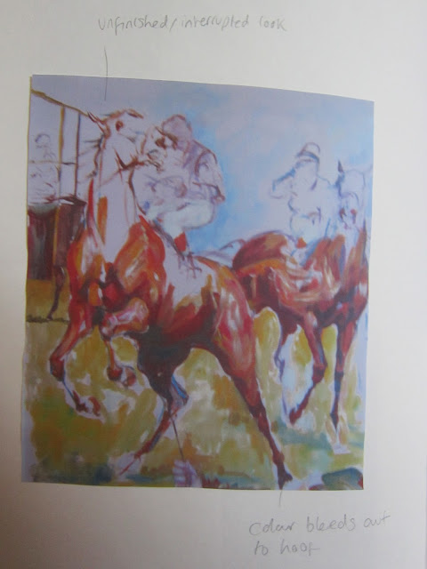
These are photos I took at the museum of Jacquie Jones's work in the cafe with notes and some of my own sketches.


Newmarket horse racing museum visit & Stubbs


I visited the National horseracing museum this weekend to look at the different styles of horse art. It was interesting to see how the ownership of the horse was more commonly focused on in the older paintings dating 100 years ago and back. These paintings were photorealism style paintings of horses standing pretty in English tack in a pretty English countryside setting. With no sign of the natural, wild spirit of the horse. These very tame paintings varied between work horses and very human sculpted breeds such as the thoroughbred. It was also interesting to see different types of art that also showed signs of human ownership, such as taxidermy mounted horse head sticking out of a stable door. The name plate and mounting of the horse showed the humans ownership and possession over the horse and sticking its head out of a closed stable door showed the oppression of the horses natural instincts and spirit.

I was really interested with Jacquie Jones work that was seen all over the walls of the cafĂ©.  She uses long loose colourful brush strokes and spontaneous mark making to capture the feel of the Newmarket racecourse and horses.
Her work that really caught my eye was her pieces where the horse wasn’t ridden or tacked or in a manmade setting. Her art shows more of the horse’s personality and spirit than the other paintings I saw at the museum but there is still  a lot of domestication with her horse racing paintings.  In these paintings her horses are more controlled and lose some of their natural flair. Whereas her pieces that have untacked loosely painted frolicking horses, tossing their heads and flicking their feet around playfully capture more what I’m looking for, the natural, undomesticated, spirit of the horse.

I like how Jacquie Jones uses colour and how it works to create an emotional response with the viewer, this is something I would like to experiment with, with my own drawings.
The visit really helped me form an idea of where I want to head with my drawings and what I will experiment with now is the form of the horse with paintbrush strokes of ink and colour. I’d like to see if using colour will help me show some of the inner feelings and flow of the horse or if it feels unnecessary. I’d also like to try drawing with ink in the current style I am working on to see if it helps make the image stronger and bolder. 

After coming home I began to look up Stubbs work, comparing it to Jacquie's work and seeing just how contained his work is. I never realized before but his horses are very stylized, they have an interesting almost blockish shape to their bodies that runs from their rump to chest. It's weirdly fitting to his work though and the idea that his works are very human dominated. The horses in his paintings are often the wealthy man's horse, dressed up and polished to perfection for him. His horses heads also have that same stylized appearance that follows throughout his work, the head really reminds me of a arabs horse head, it's lean and slightly dips in from the nose to forehead. Much unlike heavier native breads of horses.

Drawings & Guy Denning

I started working with a solid line capturing the full form of the horse with muscle detail and extras such as nostrils and cheek. I was using pictures of horses from the internet to do these drawings but later drew from videos I’d taken of horses. 


I moved on to working looser and with the looser mark making the line got lighter and thinner. I was trying to show more movement and capture quick glimpses of moments I was watching. The drawings worked best when I drew without pausing the videos and with some imagination.


I'm currently looking at Guy Denning as I find his loose drawing style really powerful and full of energy. Guy Denning is a portrait artist who does fantastic sketches using graphite and charcoal with bold powerful line work and accidental line work that happens to form with his energetic way of applying materials.
I want to work similarly with my work to try and create the same movement and energy with my horses that he does with portraits. On YouTube he has his own channel where he uploads videos of himself painting and drawing. This has been an invaluable source to see how he works and is something maybe I would like to try out for myself to really show the development process of my drawings and then I could potentially edit into those clips.

He also inspired me to do a blog as my diary for this project because I love his blog 'A drawing a day' where he literally uploads a drawing each day without fault and has done for a fair few years now. I loved the way this displayed his work, you could clearly see the progress and development going on each day. This is how I want my blog to appear, I want it to be very visual and clearly show my development throughout the project and I want it so it's there for me to keep track of my progress and see exactly what I've done and so that I can easily compare two sets of experimentation by the scroll of a mouse.